WKRM Spring '24
Overview
Clients:
-Project Connect
-Austin Transit Partnership -University of Texas at Austin: Office of Campus Planning
Tools:
-Figma
-Blender
-Adobe Illustrator
-Adobe Photoshop
-Physical Prototypes
Timeline:
-12 Weeks
-Spring '24
Team:
-WKRM Spring '24 Cohort
-Professor Jon French
Summary
This project was part of my Workroom (stylized as WKRM) class during the 2024 Spring semester of my Junior year at UT. This was a continuation of a research project we did for the same clients in our WKRM class during the previous Spring semester. Our team, led by Professor Jon Freach, was tasked with conceptualizing and designing assets which would allow students to improve how they get around the campus area, create a more confident culture of mobility, and make adoption of the light rail easier when it becomes a new mode of transit on the University of Texas at Austin campus.
Key Takeaways
-
Gained experience leading a team of people during this semester long project.
-
Gained real world experience working with clients.
-
Developed my ability to prototype and conduct ethnographic studies.
-
Had the opportunity to develop a concept over the course of two semesters with a variety team members.


DELIVERABLES


READ MORE
BACKGROUND
Who is this project for?
Project Connect is an initiative aimed at creating a light rail network to service the denizens of the city of Austin, Texas.
Project connect works directly with the Austin Transit Partnership and the government of the city of Austin. They seek to gain a better understanding of the student mobility experience and what the student culture around mobility and transit is at the University of Texas at Austin (UT).
This is all in preparation for the introduction of a light rail line which will run directly down Guadalupe Street. This street separates the UT campus from an area called West Campus which is where the majority of UT students live. This area is the most densely populated area in the entire state of Texas.

A render of the light rail from the Austin Transit Partnership's website
What exactly are we doing?
Our class was lucky enough to be given the opportunity to work directly with the Executive Vice President of the Austin Transit Partnership, Peter Mullen, as well as the Associate President of Campus Planning at UT, Brent Stringfellow. We also met directly with Paulo Faria, who has 25 years of experience working in transportation architecture.
We were tasked with developing wayfinding affordances for students and pedestrians navigating on and around the UT Austin Campus. Through frequent discourse with our clients we were able to develop a number of affordances over the course of the semester. The hope is that our clients can take our ideas and use them to develop better wayfinding systems for the UT Austin campus and its surrounding area.

RESEARCH
Foundations
For the Spring '25 semester's work we had a strong foundation of research that was conducted by the previous semester's, Fall '24, WKRM cohort. We combined this research with our own findings from the field, as well as online research of similar ideas, to develop our concepts over the course of the semester. Our team conducted research through observational note taking, interviews and questionnaires with students, and online research. The Spring '25 semester was focused more on building upon concepts from the previous semester.

Concept Development
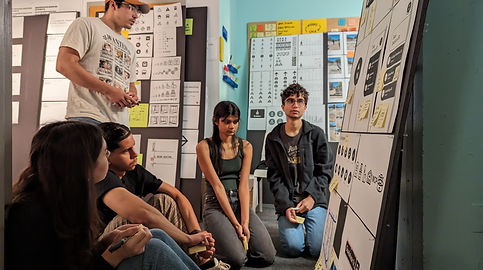
Personally, I focused mainly on the development of our Ground Level signage. I worked to develop affordances for orienting students by showing them what cardinal direction they were facing as well as showing them what streets they were on when at an intersection. I spent a lot of time refining the look of our signage by playing with sizing, color, spacing, placement, layout, and font among other things. I worked primarily by creating rough prototypes and observing how pedestrians interacted with them when I placed them out in the real world. I did a lot of observational research as well as interviews. All of our team members, including myself, had a hand in the development of every concept, however this is where I focused most of my efforts.
P.S. You can pause the video to the right by clicking on it.
CONCEPTS
Signage Types
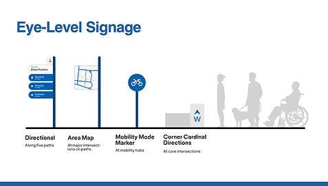
Our research identified two predominant signage types which we determined would best serve pedestrians on the UT campus. These signage types are Ground Level and Eye Level.
Ground Level Signage
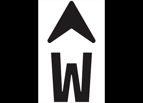
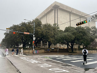
Ground Level Signage is any signage or cue which is at or around ground level. Our field observations showed us that many younger people stare at their phones when waiting to cross at crosswalks and may not even look up at all while crossing. We chose to take advantage of the fact that people's gazes were already at ground level and created signs which would be easily readable while looking at this area. These signs orient pedestrians by providing them with cardinal directions and street names.

Eye Level Signage
Eye level signage is any signage that is at or around eye level. Approximately six to eight feet tall. Eye level signage is better suited for information that needs to be read from a distance. Many people are looking straight ahead or around at their surroundings while walking. However much of the signage in the environment is above people's heads as it is intended for motorists and not pedestrians. We chose to create signage which would be at eye level for pedestrians in order to accommodate their needs. The signs we developed include directional information about nearby locations as well as a simplified area map for the UT campus.
Color Rationale
Our wayfinding system aims to accommodate the largest variety of pedestrians. According to the National Eye Institute's website, red-green color vision deficiency is "the most common type of color vision deficiency." Blue became our color of choice as one of our team members was red green color blind and he informed us that blue was the easiest color for him to pick out in the environment. More specifically we chose Pantone 300U as there is precedent for its use in the New York City subway signage system.


Typography Selection
Through online research as well as user testing we were able to select a font and typographic style which was functional and clearly readable from a distance. This is imperative for creating a wayfinding system which can quickly and easily be understood by pedestrians who are on the go and in a hurry. The font we selected was Neue Serie57 Book.

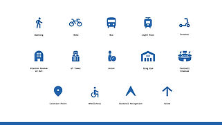
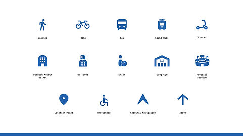
Pictograms
Our team developed a series of pictograms intended to be used in conjunction with our selected font in order to provide relevant information to a wider audience without the constraints of language. UT is a school full of a diverse range of students with varying backgrounds and cultures. It is also located in a city which is very diverse in and of itself. Not everyone who attends or visits UT speaks the same language or has the same experience level with American wayfinding systems. We needed to be able to communicate with something other than words.
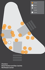
Ground Signage Plans
In order to standardize potential ground signage formats, I was tasked with creating plans for how ground signage would be arranged and placed at predetermined locations. This consistency in placement makes it easier for pedestrians to quickly identify and use the affordances we have developed for them. These plans included signage locations, diagrams for assumed lines of sight, and diagrams for where people group themselves, or "cluster", while waiting to cross at crosswalks. All of these plans were modeled around a specific intersection which we used to test our physical prototypes.


A Fun Fact
One of the earliest ideas that I brought up to our clients and to our team was a slogan or welcome message painted across Guadalupe street. Our research in the fall semester found that there is a lack of porosity on the borders of the UT campus and there is no formal gateway that designates the entrance to campus. This simple painted message was meant to be a way to create a gateway for students entering campus from the West Campus area. UT has now implemented a similar idea on Guadalupe street. They have painted the word Texas across a large portion of the street. In no way am I saying that our talks with Campus Planning influenced this but it is validating to see that a similar idea has been implemented in the real world!
UT's real world mural

My rough mockup
REFLECTION
Key Takeaways
If we were to have more time for this project I would have loved to have dived more into potential materials and accessibility related issues with our design. These include questions such as: How material choice can communicate information to those who have visual impairments or who are differently abled? How can something like braille be implemented onto signage? How does the shape, height, and overall design of each sign affect its functionality? As well as a litany of others.